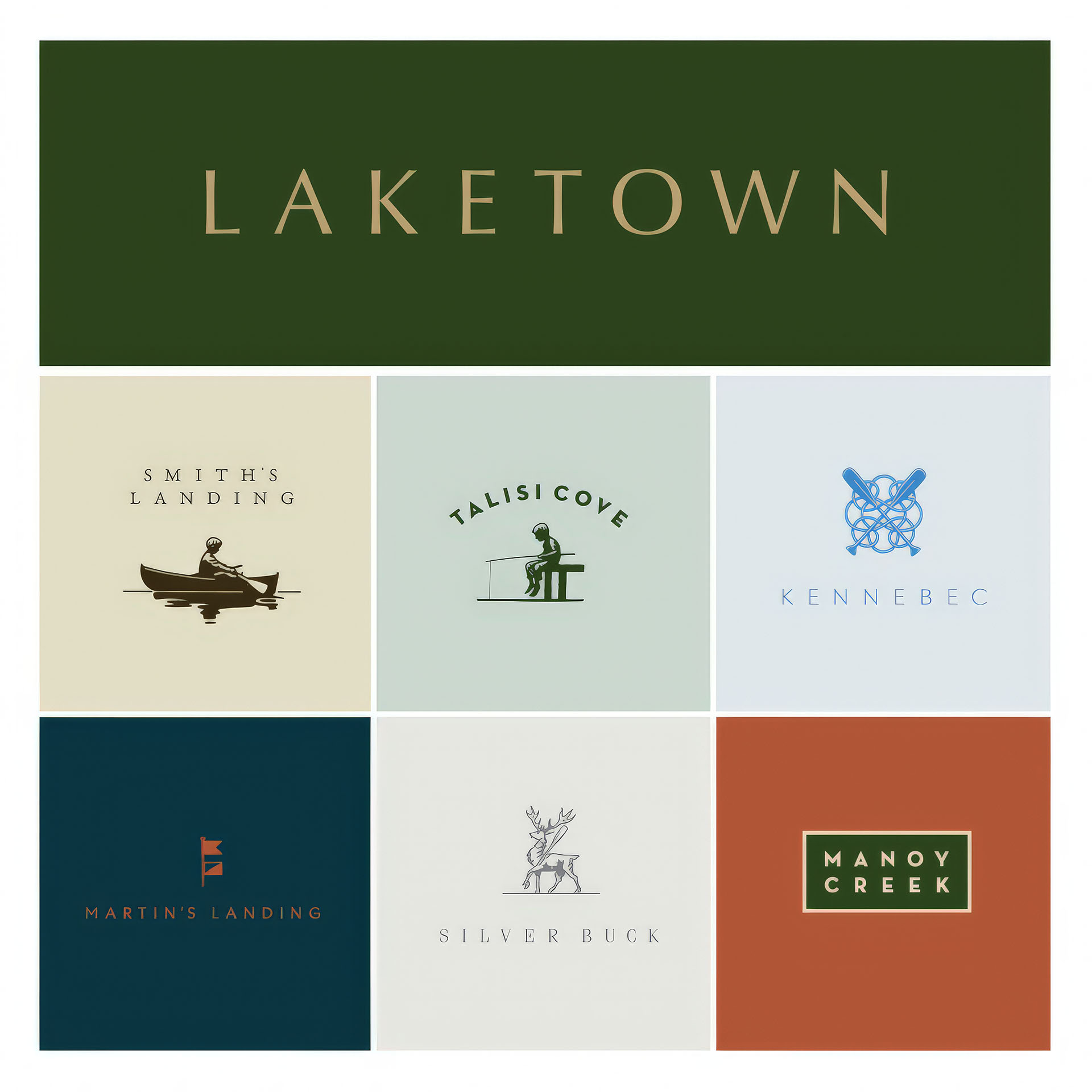
Arlington Properties


Previous Arlington logo, 1994
Arlington Properties has developed and managed multifamily properties for over 50 years. The brand was do for a refresh with efforts to maintain brand equity. We kept the familiar “home” mark with Arlington “A” at center. Clear, simple and reduced to essentials. Better scalability. Digital clarity with straight corners, positive-negative balance and increased contrast.

Typography & Order
The logo’s typography has been rebalanced. The roof diagonals now visually terminate at both ends of “Arlington” while the diagonals of the Arlington “A” visually terminate at both ends of “Properties”. These alignments along with proportional cap heights and line spacing enhance the subliminal notion of order.
Shape & Continuity
The new logo contains no fills. Its ascendant visual characteristic is the consistent use of line. Lines that make up the logo mark are twice the weight of lines that make up “Arlington” and the lines that make up those letterforms are twice the weight of those in “Properties”.